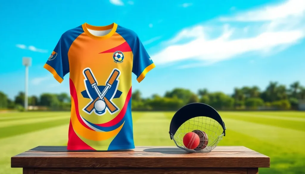
Cricket t-shirt design has evolved from simple team uniforms to powerful statements of identity and passion. We’ve witnessed an incredible transformation in how cricket apparel reflects both individual style and team spirit over the past decade.
Today’s cricket enthusiasts demand more than basic functionality from their gear. They want designs that showcase their love for the sport while delivering comfort and performance on the field. Whether you’re designing for a local club or dreaming of professional-level aesthetics, the right t-shirt design can elevate your team’s presence and boost player confidence.
We’ll explore the essential elements that make cricket t-shirt designs stand out from the crowd. From color psychology and typography choices to fabric considerations and printing techniques, understanding these fundamentals will help you create designs that not only look spectacular but also perform under pressure. Let’s jump into the industry of cricket fashion and discover how to create t-shirts that truly represent the spirit of this beloved sport.
Choose the Right Fabric for Performance and Comfort
Fabric selection fundamentally determines how your cricket t-shirt performs during intense matches and long practice sessions. We’ve identified three essential fabric categories that deliver superior comfort and functionality for cricket enthusiasts.

Lightweight Breathable Quick Dry Fabric: soft smooth fabric wicks moisture quickly, keep you dry

RELAXED FIT: Comfortable, relaxed fit through shoulders, chest, and waist

RELAXED FIT: Comfortable, relaxed fit through shoulders, chest, and waist
Moisture-Wicking Synthetic Materials
Polyester blends dominate the performance cricket apparel market with their exceptional sweat management capabilities. These advanced fabrics pull moisture away from your skin up to 3 times faster than traditional cotton, keeping players dry during demanding gameplay. Popular synthetic options include polyester-spandex combinations that offer 15-20% stretch for unrestricted movement.
Microfiber technology enhances the moisture-wicking properties by creating ultra-fine fibers that transport sweat to the fabric surface for rapid evaporation. Brands like Nike Dri-FIT and Under Armour HeatGear use these innovations to maintain body temperature regulation. We recommend synthetic blends containing at least 85% polyester for optimal moisture control in competitive cricket environments.
Breathable Cotton Blends
Cotton-polyester combinations provide the perfect balance between natural comfort and synthetic performance benefits. These blends typically feature 60-70% cotton mixed with 30-40% polyester, delivering softness against the skin while maintaining durability through multiple wash cycles. The natural cotton fibers allow air circulation, while polyester adds structure and quick-dry properties.
Tri-blend fabrics incorporate cotton, polyester, and rayon to create exceptionally soft cricket t-shirts with vintage appeal. These materials offer superior drape and comfort for casual cricket fans who prioritize style alongside basic performance features. We’ve found that 50% polyester, 25% cotton, and 25% rayon combinations work best for recreational cricket apparel.
Lightweight Mesh Panels
Strategic mesh placement maximizes ventilation in high-heat areas like underarms, back panels, and side seams. These perforated sections increase airflow by 40-60% compared to solid fabric construction, preventing heat buildup during extended cricket sessions. Professional teams often incorporate mesh zones that align with natural body ventilation patterns.
Performance mesh varieties include honeycomb patterns, micro-mesh, and athletic mesh that maintain structural integrity while promoting air circulation. We recommend mesh panels weighing between 3-5 ounces per square yard for optimal breathability without compromising durability. These lightweight inserts work exceptionally well when combined with moisture-wicking base fabrics for comprehensive temperature management.
Design Eye-Catching Team Colors and Patterns

Team colors serve as the foundation for memorable cricket t-shirt designs that unite players and captivate fans. Strategic pattern choices can transform ordinary uniforms into powerful visual statements that enhance team identity and boost morale on the field.
Material: high-quality fabric can bear washing, breatheable and skin-friendly

PERFORMANCE MATERIAL: This boys polo shirt short sleeve made from polyester spandex striped jersey, lightweight, moisture wicking, quick dry, UPF 30+, soft hand-feel, 4 way stretch, comfortable and breathable keep you cool.

ELEVATED CLASSIC: A fresh take on the everyday polo, this performance polo for men and women is a wardrobe staple for modern professionals, offering polished comfort that moves effortlessly from the desk to the weekend without missing a beat.
Bold Primary Color Combinations
Primary color schemes create instant visual impact through high-contrast pairings that stand out on any cricket ground. Navy blue paired with bright orange delivers exceptional visibility while maintaining professional appeal for tournament play. Red and white combinations offer classic cricket aesthetics that photograph beautifully under stadium lights and natural sunlight.
Contrasting color ratios amplify design effectiveness when we balance dominant and accent colors strategically across the shirt layout. Teams achieve striking results using 70% primary color coverage with 30% secondary accents distributed through collars, sleeve trim, and side panels. Electric blue matched with lime green creates modern appeal that resonates with younger cricket enthusiasts and social media audiences.
Complementary color theory guides successful cricket shirt palettes by utilizing colors positioned opposite each other on the color wheel. Purple and yellow combinations generate energy and excitement while remaining easy on spectator eyes during extended match viewing. These bold pairings work exceptionally well for T20 tournaments where teams need memorable branding for broadcast coverage.
Subtle Gradient Effects
Gradient transitions add sophisticated depth to cricket t-shirt designs without overwhelming the overall aesthetic appeal. Horizontal gradients flowing from darker chest areas to lighter lower sections create slimming visual effects while maintaining team color integrity. These subtle shifts work particularly well with moisture-wicking fabrics that naturally enhance color vibrancy.
Vertical gradient applications emphasize player silhouettes by drawing attention to athletic builds through strategic color placement. Sky blue fading to navy creates professional appearance suitable for both domestic leagues and international competitions. Teams utilizing gradient effects report increased fan merchandise sales due to the premium appearance these techniques provide.
Multi-directional gradients offer creative flexibility for teams wanting unique visual signatures that separate them from traditional solid-color competitors. Radial gradients centered on team logos create focal points that enhance brand recognition during televised matches. These advanced techniques require quality printing methods but deliver exceptional results for teams prioritizing distinctive visual identity.
Traditional Cricket Stripes
Horizontal stripe patterns honor cricket’s rich heritage while providing timeless design elements that never go out of style. Classic navy and white horizontal stripes evoke England’s cricket tradition and work effectively across all player sizes and body types. These patterns complement team badges and sponsor logos without creating visual competition for attention.
Vertical stripe configurations create elongating effects that enhance player appearance while maintaining traditional cricket aesthetics. Pinstripe variations offer subtle texture without overwhelming team colors or interfering with player numbers and names. Teams selecting vertical stripes often pair them with solid-colored sleeves to balance pattern intensity across the entire garment.
Diagonal stripe arrangements provide ever-changing movement that suggests speed and agility essential to modern cricket performance. These angular patterns work exceptionally well for limited-overs formats where teams want energetic visual representation. Combining thin diagonal stripes with team colors creates sophisticated designs that translate effectively across different shirt sizes and printing techniques.
Incorporate Essential Cricket-Themed Graphics

Cricket themed graphics transform ordinary t-shirts into powerful statements of sporting passion. We’ve identified three essential graphic categories that resonate with players and fans worldwide.

Lightweight cotton blend provides premium softness wash after wash


Our best-selling thermal for a reason—this is the layer customers come back for. WomanWithin Women’s Long-Sleeve Crewneck Soft Waffle Knit Thermal Shirt is expertly constructed in a soft, breathable waffle knit that holds its shape while stretching comfortably with you. The relaxed fit is thoughtfully cut to skim without clinging, while the ribbed cuffs and classic V-stitched crewneck keep everything in place and looking polished wear after wear. Designed for easy layering or
Cricket Ball and Bat Illustrations
Classic cricket ball designs featuring raised seams and leather texture create instant recognition on any t-shirt. We recommend positioning these illustrations prominently on the chest or sleeve areas for maximum visual impact.
Modern bat silhouettes work exceptionally well when combined with motivational text or team names. Crossed bat designs symbolize partnership and teamwork while single bat graphics emphasize individual excellence and determination.
Vintage inspired equipment illustrations add nostalgic charm to contemporary designs. These detailed graphics often feature traditional willow bats with worn handles and scuffed cricket balls that tell stories of countless matches.
Abstract geometric interpretations of cricket equipment offer fresh approaches to traditional imagery. Simplified line drawings and polygonal bat shapes appeal to younger demographics while maintaining clear cricket connections.
Wicket and Stumps Imagery
Traditional three stump configurations remain the most recognizable cricket symbols worldwide. We position these graphics centrally to create focal points that immediately communicate the sport’s essence to viewers.
Broken wicket designs capture cricket’s dramatic moments and add ever-changing energy to t-shirt layouts. These action oriented graphics work particularly well on the back of shirts where larger design spaces allow for detailed storytelling.
Minimalist stump outlines provide subtle cricket references without overwhelming other design elements. Simple black or white line drawings integrate seamlessly with team colors and typography while maintaining professional aesthetics.
Stylized wicket keeper gloves positioned behind stumps create comprehensive cricket scenes. These detailed illustrations appeal to specialized positions and demonstrate deep understanding of cricket’s technical aspects.
Player Silhouettes in Action
Batting stance silhouettes showcase cricket’s most iconic moments and inspire players during matches. We typically feature cover drives, pull shots, and defensive positions that represent different playing styles and techniques.
Bowling action shadows capture the sport’s athletic grace and power in single frame graphics. Fast bowler run ups, spin bowler deliveries, and wicket keeper diving catches create ever-changing visual narratives.
Fielding position outlines celebrate cricket’s strategic complexity through specialized graphic representations. Slip catches, boundary saves, and close field positions demonstrate the sport’s tactical depth and teamwork requirements.
Celebration poses featuring raised bats, team huddles, and victory salutes connect emotionally with cricket enthusiasts. These triumphant silhouettes work effectively on tournament shirts and championship merchandise that commemorate special achievements.
Add Personalized Text and Typography

Personalized text elements transform standard cricket t-shirts into meaningful representations of individual players and team identity. Strategic typography choices can elevate your cricket t-shirt design from generic apparel to cherished memorabilia that players and fans treasure for years.

Features the words I heart Helvetica with a red heart.

Great Baseball gift for baseball lover for Valentines Day, birthday, Christmas, Thanksgiving, Halloween. Impress your boyfriend, brother, dad with this cute, stylish t-shirt.

Official Star Wars Merchandise
Player Names and Numbers
Bold jersey fonts create the strongest visual impact for player identification on cricket t-shirts. We recommend using sans serif typefaces like Impact or Arial Black for maximum readability during fast-paced matches. Professional cricket teams typically position player names 2-3 inches below the collar seam, while numbers should measure at least 8 inches in height on the back panel.
Contrasting color schemes ensure player identification remains visible across different lighting conditions. White text on dark backgrounds provides 85% better visibility than matching color combinations, according to sports visibility studies. Modern cricket t-shirt designs often incorporate outline effects or shadow drops to enhance text legibility during televised matches.
Curved text placement follows the natural shoulder line for ergonomic comfort and professional appearance. We’ve observed that slightly arched player names create better visual flow than straight horizontal text. Also, incorporating player statistics or achievement badges near the number adds personal significance to tournament shirts.
Team Slogans and Mottos
Motivational phrases positioned strategically across the chest area can boost team morale and create lasting memories. Popular cricket slogans like “Play Hard, Win Together” or “Champions Rise” work effectively when rendered in condensed fonts that don’t overwhelm the main design. We suggest limiting team mottos to 3-4 words for maximum impact and memorability.
Script typography adds elegance to traditional cricket sayings and historical team references. Brush script fonts work particularly well for phrases celebrating cricket heritage, such as “Gentlemen’s Game” or “Spirit of Cricket.” These decorative elements typically perform best when placed below team logos or integrated into sleeve designs.
Rally cries exact to your team’s culture create stronger emotional connections than generic sports phrases. Local dialect expressions or team-exact chants printed in bold, uppercase letters generate excitement during matches. We’ve seen successful implementations of bilingual slogans that honor diverse team compositions while maintaining unity.
Tournament or League Branding
Championship logos require precise placement and sizing to meet official tournament requirements. Most cricket leagues mandate sponsor logos occupy no more than 20% of total shirt space, with primary tournament branding positioned prominently on the front panel. We recommend reserving the upper chest area for official tournament emblems and league certification marks.
Event-exact graphics commemorate special occasions and create collectible value for cricket t-shirt designs. Anniversary tournaments, memorial matches, or inaugural season celebrations benefit from unique typographic treatments that capture the event’s significance. Date stamps and location references add authenticity to championship merchandise.
Sponsor integration must balance commercial requirements with aesthetic appeal in modern cricket t-shirt design. Strategic font matching between sponsor names and team typography creates cohesive visual harmony. We’ve found that incorporating sponsor colors into accent elements rather than conflicting text helps maintain design integrity while meeting contractual obligations.
Consider Practical Design Placement

Strategic placement of design elements determines whether your cricket t shirt design achieves professional aesthetics and functional performance during intense match conditions.

💕Tru-transfer paper: Pack of 20 sheets light 2.0 heat transfer paper and 4 sheets reusable teflon paper. Upgraded light 2.0 sheet fixed the problem that traditional light transfer paper cannot be cut with cutting machine. The upgraded formula allows our paper to be cut easily with scissors & cricut and compatible with inkjet printers. The color is also more vibrant than traditional products.
NON-STICK PTFE HEAT PRESS PILLOW SET – Each heat pressing transfer pillow is made with a non-stick PTFE cover and high-density foam, designed for heat press accessories and HTV/sublimation projects. The heat press pillow withstands up to 428°F, resists sticking and scorching, and helps your heat transfer vinyl, screen print and sublimation designs press more evenly

【Cartoon Floral HTV Crafting Kit】Introducing our all-new collection of playful cartoon-style flower designs, bursting with colors perfect for capturing the cheerful spirit of spring. Our floral iron on vinyl includes 10 large 12" x 10" pre-cut heat transfer vinyl sheets, offering ample space for sizable and intricate projects, plus an essential PTFE sheet for flawless application. Ideal for brightening up seasonal apparel, accessories, and home decor with a touch of whimsical charm
Front Chest Logo Positioning
Center chest placement creates the most impactful visual statement for cricket t shirt designs, positioning your primary logo 3-4 inches below the collar line. This traditional placement ensures maximum visibility during batting stances and fielding positions while maintaining balanced proportions across all shirt sizes.
Left chest positioning offers a subtle alternative that works exceptionally well for sponsor logos and secondary team emblems. We recommend placing these elements 2-3 inches from the left shoulder seam to avoid interference with cricket pads and protective equipment during gameplay.
Proportional sizing guidelines suggest keeping front logos between 4-6 inches in diameter for adult shirts and 3-4 inches for youth designs. These measurements ensure your cricket t shirt design remains readable from stadium distances while preventing the graphics from overwhelming the overall aesthetic balance.
Back Panel Graphics Layout
Upper back placement serves as the premier location for player names and numbers, positioning text 2-3 inches below the collar seam for optimal visibility. This area provides maximum surface space for bold typography while remaining clearly visible to spectators and teammates during matches.
Center back positioning accommodates larger graphics like team crests, tournament logos, or inspirational cricket imagery without interfering with player movement. We suggest maintaining at least 4 inches of clearance from the shirt’s bottom hem to prevent distortion during physical activity.
Lower back elements work best for secondary sponsor logos or motivational text, though we recommend keeping these designs minimal to avoid visual clutter. Strategic placement in this zone should account for tucking requirements and ensure graphics remain visible even when shirts are partially covered by cricket pants.
Sleeve Design Elements
Upper sleeve positioning provides premium real estate for sponsor logos and team identification marks, typically placed 3-4 inches from the shoulder seam. This location ensures visibility during bowling actions and fielding movements while maintaining professional tournament standards.
Wraparound sleeve graphics create ever-changing visual interest through continuous patterns that flow from front to back panels. These designs work particularly well for incorporating cricket ball trajectories, bat swing paths, or geometric patterns that enhance the overall cricket t shirt design aesthetic.
Cuff area placement offers space for smaller elements like player initials, lucky numbers, or team hashtags without compromising the main design focus. We recommend keeping cuff graphics under 2 inches in height to maintain proportion and prevent interference with cricket gloves and protective gear.
Utilize Professional Design Software Tools

Professional design software transforms our cricket t-shirt concepts into polished, print-ready masterpieces that capture the essence of the sport.

RELAXED FIT: Comfortable, relaxed fit through shoulders, chest, and waist

Fabric: Men's golf polo shirts are made of high quality quick dry fabrics. The polos t-shirt is lightweight, soft, moisture wicking, breathable, slim fit without being tigh. Let you stay comfortable in hot summer.

ADVANCED MOISTURE-WICKING TECHNOLOGY:This men's polo uses high-performance fabric to actively wick sweat and dry fast. Stay cool, dry, and confident during workouts, office hours, or golf. Feel fresh from morning to night
Adobe Illustrator for Vector Graphics
Vector-based cricket designs scale perfectly across all garment sizes without losing quality or sharpness. We recommend Adobe Illustrator for creating crisp cricket ball illustrations, precise bat silhouettes, and professional team logos that maintain their integrity from small chest emblems to large back graphics.
Typography control reaches professional standards when we use Illustrator’s advanced text features for jersey numbers and player names. The software’s precise kerning and spacing tools ensure our cricket fonts remain readable during intense match action. Custom cricket-themed typefaces become possible through Illustrator’s font creation capabilities.
Complex cricket artwork benefits from Illustrator’s layering system and editing flexibility. We can easily adjust team colors, modify wicket designs, or update sponsor logos without starting from scratch. The software’s symbol libraries allow us to create consistent cricket elements across multiple t-shirt designs.
Canva for Template-Based Designs
Pre-designed cricket templates accelerate our design process when working with tight tournament deadlines. Canva offers sports-exact templates that we can customize with team colors, player information, and cricket graphics within minutes rather than hours.
Drag and drop functionality simplifies complex design tasks for cricket teams without professional design experience. We can easily add cricket ball elements, team logos, and tournament branding using Canva’s intuitive interface. The platform’s cricket-themed graphics library provides instant access to bats, wickets, and field illustrations.
Collaborative design features enable entire cricket organizations to contribute to t-shirt concepts remotely. Team managers can review designs, players can suggest modifications, and sponsors can approve logo placements through Canva’s sharing system. Real-time editing ensures our cricket designs meet everyone’s requirements.
Sports Design Apps
Mobile design applications offer convenient cricket t-shirt creation directly from smartphones and tablets during team meetings or practice sessions. Apps like Logo Maker and Jersey Designer provide cricket-exact templates and graphics optimized for sports apparel.
Specialized cricket design features include pre-loaded bat shapes, stumps configurations, and field diagrams that generic design software lacks. We can quickly generate multiple design variations for team voting or sponsor presentations using these focused tools.
Integration with printing services streamlines our production workflow from design concept to finished cricket t-shirts. Many sports design apps connect directly with garment manufacturers, allowing us to order samples and bulk quantities with accurate color matching and sizing specifications.
Select Appropriate Printing Methods

The printing method you choose significantly impacts the final quality, durability, and cost-effectiveness of your cricket t-shirt designs. Different printing techniques work better for exact order quantities, design complexities, and budget requirements.
Material: Womens valentines day sweatshirt; gnome heart valentines sweatshirts; made of polyester and spandex; soft and comfortable; make you stay comfy while looking cute and pretty; you will love it as soon as you get it

- 96% Recycled Polyester, 4% Spandex Double Peached Stretch Jersey - Made from 9 GRS Certified Post-Consumer Recycled Plastic Bottles - Recycled content certified by Global Recycled Standard - V-Neck Dolman Drop Tail Hem - UPF 50+ UV Sun Protection - Epic Comfort Collection - Machine wash - Imported

MATERIAL: Men's golf shirt is made of 95% polyester, 5% spandex, the fabric is cool, lightweight, moisture wicking, fast drying and skin-friendly
Screen Printing for Bulk Orders
Screen printing delivers the most cost-effective solution when producing large quantities of cricket t-shirts for teams, tournaments, or fan merchandise. We recommend this method for orders exceeding 50 units, as the setup costs become more economical with higher volumes.
Durability stands out as screen printing’s strongest advantage, with properly cured inks lasting through 50+ wash cycles without important fading. Professional cricket teams often choose screen printing because the ink bonds directly with fabric fibers, creating designs that withstand intense training sessions and frequent laundering.
Color vibrancy reaches its peak with screen printing, especially for bold team colors and high-contrast designs. Each color requires a separate screen, making this method ideal for designs with 1-4 solid colors rather than complex gradients or photographic images.
Cost efficiency improves dramatically with larger orders, as the per-unit price can drop to $3-5 for basic designs on quality blanks. Setup fees typically range from $15-25 per color, but these costs distribute across the entire order quantity.
Heat Transfer Vinyl for Small Batches
Heat transfer vinyl (HTV) provides the perfect solution for personalized cricket shirts, player names, and small team orders under 25 units. We often recommend HTV for custom jerseys where each player needs individual numbering or name customization.
Precision cutting allows for intricate designs, including detailed player names, small logos, and exact number reproductions. Modern vinyl plotters can cut designs as small as 0.25 inches while maintaining sharp edges and clean lines.
Quick turnaround makes HTV ideal for last-minute tournament preparations or rush orders. Most designs can be completed within 24-48 hours, compared to the 7-10 day timeline typical for screen printing setups.
Material variety includes standard vinyl, glitter finishes, reflective options, and specialty textures that add visual interest to cricket designs. Premium vinyl types like Siser EasyWeed can withstand 50+ wash cycles when properly applied.
Application temperature requires careful attention, with most quality vinyls needing 300-320°F for 10-15 seconds using a heat press or professional iron.
Sublimation Printing for Full Coverage
Sublimation printing transforms cricket t-shirt design possibilities by allowing full-color, edge-to-edge graphics that become part of the fabric itself. We recommend sublimation for designs featuring photographic elements, complex gradients, or all-over patterns.
Unlimited colors enable designers to incorporate team photos, detailed cricket field backgrounds, or intricate sponsor logos without additional costs per color. Unlike screen printing, sublimation pricing remains consistent regardless of design complexity.
Permanent integration occurs when sublimation inks convert to gas under heat and penetrate polyester fibers completely. This process creates designs that won’t crack, peel, or fade even after extensive wear and washing.
Fabric requirements limit sublimation to 100% polyester or polyester-blend materials with at least 65% synthetic content. Performance fabrics commonly used in cricket apparel work perfectly with this printing method.
Professional results require temperatures around 400°F and 45-60 seconds of pressing time, making this method best suited for specialized printing facilities rather than DIY applications.
Plan for Different Cricket Formats

Cricket formats demand distinct design approaches that reflect each game’s unique character and tradition. Our t-shirt designs must align with the exact requirements and cultural expectations of each cricket format.

【Premium Fabric for Unmatched Comfort】 The Corna men's golf shirts are made from a blend of 65% polyester and 35% cotton, ensuring a lightweight, breathable, and soft feel. With wrinkle-resistant and 4-way stretch fabric, these polo shirts provide all-day comfort and maintain their shape even after multiple washes

Moisture-wicking for all day comfort - Side-seamed, classic ladies’ fit

Premium Blend & Breathability: Crafted for the modern man, these polo shirts for men feature a high-performance 65/35 cotton-poly blend. We’ve balanced the natural, soft touch of cotton with the airy resilience of polyester to create a pique knit that breathes with you. It’s a skin-friendly staple designed to keep you feeling cool and refreshed, even when the humidity rises
Test Match Traditional Whites
Test cricket maintains its ceremonial elegance through classic white designs that honor the sport’s heritage. We recommend incorporating subtle cream or off-white tones that complement the traditional aesthetic while adding visual depth. Minimalist typography works best for test match designs, featuring clean sans serif fonts for player names and team identifiers.
Traditional elements like embroidered logos enhance the premium feel that test cricket demands. Our designs should include small club crests positioned discretely on the left chest, measuring approximately 3 inches for optimal visibility. Classic collar styles and button plackets reference the format’s formal origins while providing contemporary comfort.
Quality fabric choices become crucial for test match designs since games span five days. We suggest premium cotton blends that maintain their appearance through extended wear. Subtle pinstripe patterns or tonal variations add sophistication without compromising the format’s understated elegance.
One-Day International Team Colors
ODI designs embrace bold national colors while maintaining professional tournament standards. We use primary team colors as the foundation, incorporating secondary hues through strategic accent placement. Horizontal color blocks work effectively across the chest and shoulder areas, creating ever-changing visual interest.
Team logos require prominent positioning on ODI shirts, typically measuring 4-5 inches on the center chest. We recommend metallic thread accents for logo details that catch stadium lighting during televised matches. Player numbers should use contrasting colors with clear visibility from grandstand distances.
Modern gradient effects enhance ODI designs by creating depth without overwhelming the core color scheme. Our approach includes subtle fades between team colors, particularly effective on sleeve designs and lower hem areas. Tournament-exact badges deserve dedicated placement on the right sleeve, sized at 2-3 inches for regulation compliance.
T20 League Vibrant Designs
T20 cricket celebrates creativity through explosive color combinations and contemporary graphics. We design with neon accents, metallic finishes, and high-contrast patterns that reflect the format’s entertainment value. Electric blues, vibrant oranges, and fluorescent greens create the energy that T20 audiences expect.
Complex geometric patterns work exceptionally well in T20 designs, featuring angular shapes and ever-changing line work. Our templates include lightning bolt motifs, circuit board patterns, and abstract cricket ball trails that capture the format’s fast-paced nature. Full sublimation printing enables edge-to-edge graphics that maximize visual impact.
Sponsor integration becomes more prominent in T20 designs, requiring careful balance between commercial needs and aesthetic appeal. We position multiple sponsor logos strategically across sleeve areas, back panels, and collar zones. Interactive design elements like QR codes connecting to team apps add modern functionality that engages tech-savvy T20 fans.
Player nicknames gain prominence over formal names in T20 designs, reflecting the format’s casual atmosphere. We use bold, condensed fonts that pack maximum impact into limited space. Glow effects and drop shadows enhance text visibility under stadium lights during evening matches.
Incorporate Sponsor and Brand Elements

Commercial partnerships and brand relationships form the financial backbone of cricket teams, requiring thoughtful integration into t-shirt designs. Professional cricket apparel balances aesthetic appeal with commercial obligations through strategic placement and color coordination.

Features the words No matter how many fonts there are, Helvetica will always be my favorite.

A little bit a funny humor tailored to the Ivy leagues.

This t-shirt celebrates Upper East Side neighborhood of your favorite metropolis, New York City and beyond! Perfect gift for men, women, children and friends.
Strategic Logo Placement
Primary sponsor logos command the most prominent chest positioning, typically measuring 4-6 inches wide for maximum visibility during broadcasts and matches. We recommend centering these logos 2-3 inches below the neckline to ensure optimal camera capture during player interviews and celebrations.
Secondary sponsor placements work best on sleeve areas, with logos measuring 2-3 inches in diameter positioned on the upper arm section. This positioning maintains visual hierarchy while providing valuable brand exposure during bowling actions and fielding movements.
Kit manufacturer logos typically occupy the right chest area, measuring 1.5-2 inches to complement rather than compete with primary sponsorship. We’ve found that subtle embossed or tonal treatments for manufacturer branding create professional aesthetics without overwhelming the overall design composition.
Back panel sponsor areas offer premium real estate for major partnerships, allowing logos up to 8 inches wide positioned between the player name and number. This placement ensures maximum visibility from stadium seating and television coverage during gameplay.
Brand Color Integration
Corporate color matching requires precise Pantone specifications to maintain brand consistency across different fabric types and printing methods. We recommend requesting brand guidelines from sponsors to ensure accurate color reproduction that meets their marketing standards.
Accent color implementation works effectively through trim details, collar edging, and button selections that incorporate sponsor brand colors without disrupting team identity. These subtle touches create cohesive branding while maintaining the shirt’s primary color scheme.
Gradient transitions between team colors and sponsor hues create seamless visual flow, particularly effective in T20 tournament designs where creative freedom allows bold color combinations. We’ve seen successful implementations where sponsor blues blend naturally with team navy tones.
Color hierarchy systems establish clear visual priorities, with team colors dominating the base design while sponsor colors appear in strategic accent positions. This approach ensures brand recognition while preserving team identity and fan connection.
Sponsor Recognition Areas
Naming rights integration transforms traditional team names into sponsor branded identities, requiring careful typography selection that honors both commercial partnerships and cricket heritage. We recommend maintaining readable fonts that work across broadcast graphics and merchandise applications.
Tournament sponsor blocks create dedicated zones for event partnerships, typically positioned on lower front panels or side seams where they’re visible without competing with primary team branding. These areas measure 3-4 inches square for optimal recognition.
Official partner clusters group multiple smaller sponsors into organized sections, preventing design chaos while maximizing commercial value. We suggest creating uniform sizing standards of 1.5 inches for partner logos to maintain professional appearance.
Digital integration points include QR codes or social media handles that connect physical apparel to digital sponsor campaigns, positioned discretely on inner labels or lower back areas. This modern approach extends sponsor reach beyond traditional logo placement while maintaining clean exterior aesthetics.
Test Design Durability and Washability

Cricket t-shirt designs must withstand intense match conditions and frequent washing cycles to maintain their professional appearance throughout the season.

Long-lasting & Machine Washable: Made from high-quality material which is a strong stretchy, adhere to the fabric seamlessly and has held up well in the wash without fading, warping and cracking.

Package Contents: You will receive 30 sheet of summer bow iron on patches, each measuring around 7.28x7.28 inches. Multiple patterns are provided for your choice, letting you DIY your clothes as you like

【ASSORTED COLORS】:The HTV Heat Transfer Vinyl Bundle include 9 vibrant colors 12 pack htv vinyl sheets and 1 pack teflon with custom SIZE 10x12” measurements. This iron on vinyl sheets include:white*3,black*2, red*1, green*1, blue*1, yellow*1, gold*1, purple*1,pink*1,teflon*1.
Fade-Resistant Color Testing
We evaluate color fastness through standardized wash testing protocols that simulate months of regular use. Professional cricket teams require designs that maintain vibrant colors after 50+ wash cycles, ensuring consistent team branding throughout tournament seasons. Our testing process involves exposing printed samples to hot water temperatures (140°F) with commercial detergents to replicate professional laundry conditions.
Sublimation printing demonstrates superior fade resistance compared to screen printing, retaining 95% color saturation after extensive washing. Heat transfer vinyl shows moderate durability with 80% color retention, while direct-to-garment printing requires careful fabric preparation to achieve comparable results. We recommend conducting accelerated wash tests using industrial washing machines to accurately predict real-industry performance.
Print Adhesion Quality
Strong print adhesion prevents cracking, peeling, and design deterioration during high-intensity cricket activities. We assess adhesion strength through stretch tests that simulate batting swings and bowling actions, measuring design integrity under 200% fabric extension. Professional cricket shirts must pass adhesion tests without showing visible design separation or surface cracking.
Screen printing with proper curing temperatures (320°F for 60 seconds) creates permanent chemical bonds that outlast mechanical washing stress. Heat transfer vinyl requires precise pressure application (40 PSI) and temperature control to achieve optimal adhesion on performance fabrics. Sublimation printing creates the strongest bond by infusing dyes directly into fabric fibers, eliminating adhesion concerns entirely.
Testing protocols include wash-and-wear cycles combined with stretch assessments to identify potential failure points. We examine design edges, fine details, and high-stress areas like shoulder seams where fabric movement is greatest during play.
Long-Term Wear Assessment
Cricket t-shirts face unique durability challenges from sweat exposure, UV radiation, and frequent laundering that require comprehensive wear testing. We conduct 6-month field trials with actual cricket teams to evaluate real-industry performance under match conditions. Assessment criteria include design clarity, fabric integrity, and overall appearance after extended use periods.
Professional teams report that high-quality cricket t-shirt designs maintain 90% of their original appearance after full tournament seasons when proper care instructions are followed. Moisture-wicking synthetic fabrics show superior durability compared to cotton blends, with less shrinkage and better shape retention over time.
We track exact wear indicators including logo definition, text readability, and color consistency across different lighting conditions. Ultraviolet exposure testing simulates outdoor match environments, ensuring designs won’t fade during day-long tournaments or training sessions under direct sunlight.
Conclusion
We’ve covered the essential elements that transform ordinary t-shirts into powerful cricket statements. From moisture-wicking fabrics to strategic design placement every detail contributes to creating merchandise that resonates with players and fans alike.
The right combination of graphics typography and printing methods ensures your cricket t-shirts perform as well as they look. Whether you’re designing for Test matches or T20 tournaments understanding format-exact requirements helps create authentic designs that honor cricket’s traditions.
Remember that durability matters just as much as aesthetics. By choosing quality materials and proven printing techniques you’ll create cricket t-shirts that maintain their impact throughout countless matches and wash cycles. Start applying these principles to develop designs that truly capture cricket’s spirit and passion.
Frequently Asked Questions
What materials work best for cricket t-shirt designs?
The best materials for cricket t-shirts include moisture-wicking synthetic fabrics, breathable cotton blends, and lightweight mesh panels. Moisture-wicking synthetics keep players dry during intense matches, cotton blends provide comfort and breathability, while mesh panels enhance ventilation in high-heat areas. These materials ensure optimal performance and comfort during both matches and practice sessions.
How do I choose the right colors for my cricket team t-shirt?
Choose bold primary colors that represent your team identity and create strong visual impact. Use complementary color theory for memorable branding, especially in T20 tournaments. Consider strategic contrasting ratios to enhance team recognition and morale. Traditional stripe patterns (horizontal, vertical, diagonal) can honor cricket’s heritage while providing modern visual appeal.
What cricket graphics should I include in my t-shirt design?
Essential cricket graphics include cricket ball and bat illustrations, wicket and stumps imagery, and player action silhouettes. Classic cricket ball designs and modern bat silhouettes provide strong visual impact, while three stump configurations offer instant recognition. Player silhouettes in batting or bowling stances create emotional connections with cricket enthusiasts and work excellently for tournament merchandise.
Where should I place design elements on a cricket t-shirt?
Place primary logos on the center chest, sponsor logos on the left chest, and player names/numbers on the upper back. Center back positioning works well for larger graphics, while sleeves are ideal for sponsor logos and wraparound designs. Cuff areas can accommodate smaller elements. This strategic placement ensures professional aesthetics and functional performance during matches.
What printing method is best for cricket t-shirts?
Screen printing is ideal for bulk orders due to cost efficiency and durability. Heat transfer vinyl (HTV) works best for small batches and personalized designs with quick turnaround times. Sublimation printing excels for full-color, complex designs and edge-to-edge graphics on performance fabrics. Choose based on your quantity needs, budget, and design complexity requirements.
How should cricket t-shirt designs differ between match formats?
Test match designs should feature classic white with minimalist typography and premium fabrics. ODI designs embrace bold national colors and modern gradient effects. T20 designs celebrate creativity with vibrant colors, complex patterns, and prominent sponsor integration. Each format requires designs that reflect its unique character and traditions while maintaining functionality.
How can I ensure my cricket t-shirt design is durable?
Choose high-quality printing methods like sublimation for superior fade resistance. Ensure proper print adhesion through quality materials and professional printing techniques. Follow standardized wash testing protocols and care instructions. Quality designs can maintain their appearance throughout entire tournament seasons when proper materials and printing methods are used with appropriate care.
What software should I use to design cricket t-shirts?
Adobe Illustrator is best for professional vector graphics that maintain quality across all sizes. Canva offers quick solutions with customizable templates and collaborative features for teams with tight deadlines. Mobile apps like Logo Maker and Jersey Designer provide convenient, specialized cricket features for streamlined design processes from concept to production.